Editing Data Canvas Visualizations
Data Canvas has different visualizations you can use to make sense of your data. Each type of visualization has different settings you can use to customize its appearance, such as sorting data and reordering columns.
To edit visualizations:
-
Go to Main Menu [
 ] > Data Canvas, and select your client.
 -
Select the dashboard from the dashboard list.
-
Select Edit dashboard from the dashboard's Options [
 ].
]. -
Select Edit from the tile's Options [
]. -
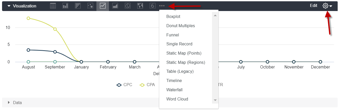
To change the visualization type, click a chart icon from the visualization section. Click the ellipses to view more chart options.
-
To change the visualization settings, click the gear in the Visualization section.
-
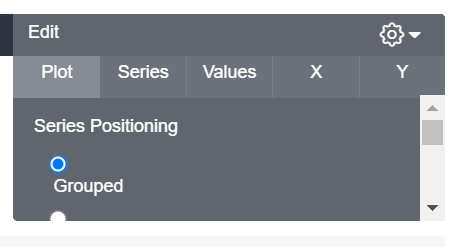
Make your changes in the Edit dropdown.
Visualization setting options available for editing vary depending on the chart type or other settings you have chosen.
-
When you are done making your changes, click the gear icon to close the dropdown. Your changes are automatically applied.
-
Click Save to save your changes to the tile.
-
Click Save from the blue dashboard edit bar to save the changes to the dashboard.
Sorting Data
Unpivoted data is sorted by the following by default:
-
The first date dimension, descending
-
If no date dimension exists, the first measure, descending
-
If no measure exists, the first added dimension, ascending
To see a field's sort order, hover next to the field's name. A number and arrow indicting the sorting direction—ascending or descending—appears next to field name.

To sort data differently than the default order, hover over the column header to display the arrows, then click the column header.
To sort by multiple columns, press the Shift key, then click the column headers in the order that you want them sorted.
The sort order and arrow indicting ascending or descending displays next to the column header.

To change the sort order, click the column you want for the first sort order. The column updates to 1, and the other sort orders are removed.
Reordering Columns
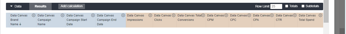
Columns in the Data section are organized by field type:
-
Dimensions
-
Measures
For the most part, columns can be reordered to display differently in your visualization within each field type, but can't be moved out of their field type section.
For example, in the Data table below, you can reorder the Impressions, Clicks, Total Conversions, and other Measurement columns amongst themselves. However, you can't place the Impressions column between the Brand Name and Campaign Name column, since those are Dimension columns.
To reorder columns in the Data table, click a column header and move the column to its desired position.
Click Run to see the updated visualization.